This is a DHTML Tip Message that enhances websites with small popup information boxes to help visitors around your website.
You may set a
title for your tip and you
may not. You can position your tip as
Right which is the default, or
center or
left or
float or
fixed (You many need to scroll up to see this). You also can make your tip
sticky with a close link or
keep it moving with the mouse around the page.
You may also control the
left and the
top coordinates of the message from the mouse. You many also add
visual effects to the tip message in MSIE 5.5 or later. You can change the
hole style by using different HTML code in the text. You also may insert
any html tags you want.
Element:
Child element:
Display the element you select in the page and it's Id if the element has the Id.
In case you select a table element like a Row the extension enable the "child element" combo box because Dw is enable to return the Row object my extension need to apply the Advanced ToolTip so in this combo box you will find the list of the rows of the selected tables and if they have the Id attribute like this image:
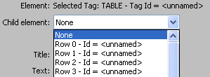
In this list you must select the row element you want apply the tooltip.
This problem is only for the row. If you select a single cell or the entire table no selection in this combo is needed and the combo is disabled.
Title:
Sets the tip message's title leave empty for none. you may also insert single quoted html tags. example single quoted .
Text:
Sets the tip message's body text you may also insert single quoted html tags.
Open the dynamic field popup to get the value froma dynamic source like a recordset
Open the Zoom Window for more space in which to enter the TEXT
Title color:
Sets the title's text color the bold text at the top you could use HEX values like #ffffff or normal like white
Text color:
Sets the text's text color in the tip message. You could use HEX values like #ffffff or normal like white
Title Bg Color:
Sets the title's background Color leave empty to make transparent
Text Bg Color:
Sets the text's background Color empty to make transparent
Title BgImage:
You may want to insert a background Image for the TITLE rather than a background color, if the image is not in the same directory or folder as your html file enter the full location of the Image Example : ["pictures/bgimg.gif"] and don't forget to specify the image's extension .jpg , gif ect or select the image with the Browse button
Text BgImage:
You may want to insert a background Image for the TEXT rather than a background color, if the image is not in the same directory or same folder as your html file enter the full location of the Image Example : ["pictures/bgimg.gif"] and don't forget to specify the image's extension .jpg , gif ect or select the image with the Browse button
Title text align:
Sets the position or Alignment of the TITLE, you have 3 choices left which is the default, center, right
Text text align:
Sets the position or Alignment of the TEXT, you have 3 choices left which is the default, center, right
Title font face:
Sets the title's font family or face Example ["Tahoma"] Leave None for Verdana,Arial,Helvetica Which is the default
Text font face:
Sets the TEXT'S font family or face Example ["Tahoma"] Leave Empty for Verdana,Arial,Helvetica Which is the default
Title font size:
Sets the title's font size. Numbers only. You many use negative or positive values like -1 or +1 or absolute values like 1, 2, 3 the default size is 1
Text font size:
Sets the Text's font size. Numbers only you many use negative or positive values like -1 or +1 or absolute values like 1, 2, 3 the default size is 1
Width:
Sets the width of the tip message. Full Numbers only. The default width is 200
Height:
Sets the height of the tip message. Full Numbers only. The default height is the height needed to fit the content however you may want to add extra height, if you do enter is value here
Tip position:
Sets the tip message's popup position you have 5 choices left , center , right , float , fixed if you set it as
1 left: the tip message will popup on the left side of the mouse.
2 center: the tip message will popup in the center , the mouse will be in the center of the tip message.
3 right: this is the default position you may leave the entry empty or set it as right. In this case the tip message will popup on the right side of the mouse
4 float: the tip message will not move with the mouse rather it will popup at the coordinates of the X,Coordinate and Y,Coordinate entries. And if you scroll down or left the scroll values are added to the X,Coordinate and YCoordinate values so the tip message will always float in the same place no matter how much you scroll left or right, in simple words "Static position" 5 fixed: the tip message will not move with the mouse rather it will popup at the coordinates of the YCoordinate and YCoordinate entries And it will not float with the scrollbars.
Coordinate X:
If the tip message's position is set as left or right it sets the X coordinate of the tip message relative to the position of the mouse.
If the tip message's position is set as float or fixed it sets the X coordinate of the tip message relative to the window. You may set positive or negative numbers.
The default value is 10
Coordinate Y:
If the tip message's position is set as left or right or center it sets the Y coordinate of the tip message relative to the position of the mouse.
If the tip message's position is set as float or fixed it sets the Y coordinate of the tip message relative to the window. You may set positive or negative numbers.
The default value is 10
Sticky style:
Sets the Sticky Style type of the tip message you have 2 choices sticky , keep
sticky:
The tip message will not hide after your mouse goes off the link and it will only be positioned once .
A Close link is automatically generated and inserted at the top right of the tip message so if you would like to hide the tip message just click it. The properties (color,bgcolor ect) of the close link are set from the title's properties so the close link and title will have exactly the same style and look as the title.
This is designed specially for the need of inserting links in the tip message or any thing that involves using the mouse in tip message's content. leave this entry empty for none sticky style. keep:
The tip message will not hide after your mouse goes of the link rather the tip message will move with your mouse around the page. This will produce the same effect as if you didn't specify the mouse out function in the link.
Border size:
Sets the border size which is the colored frame around the tip message. Its color is set from the title's bgcolor. and again Full Numbers only . if you don't want a border set it as 0 or leave its entry empty
Pad text area:
Adds extra padding to the area of the text this adds extra space from the left, top, right, and bottom in the text content
Transition:
The transition is the cool visual effect when the tip message shows. You have a choice between 52 different effects, with 2 random methods.
This requires Microsoft Internet Explorer 5.5 or later but has been removed from IE10.
Duration:
Sets the duration of the transition the time desired of transition action in seconds. You may use decimal numbers such as 0.3 or full numbers like 1 . Setting the value to 0 also disables the transition. This requires Microsoft Internet Explorer 5.5 or later but has been removed from IE10
Transparency level:
Add transparency level from 1 to 99 the decreasing values increase transparency so if you set it to 1 you will barley see the tip message and that's if you have good eyesight, if you set it to 99 it will be least transparent get the point?. Set 0 for none. This requires Microsoft Internet Explorer 5.5 or later but has been removed from IE10
Shadow type:
You may apply one of two shadow styles simple or complex or none for don't have shadow. You must also add a shadow color to enabled it. This requires Microsoft Internet Explorer 5.5 or later but has been removed from IE10
Shadow color:
Sets the shadow color. Leave empty to also disable the shadow . This requires Microsoft Internet Explorer 5.5 or later but has been removed from IE10