This panel define the columns in the data grid
Connection:
Only available when edit is enabled.
Define the connection the extension use to insert/edit/delete the data grid rows.
Table name:
Only available when edit is enabled.
Define the table where the extension insert/edit/delete the data grid rows.
Recordset:
The recordset the extension use to populate the data grid rows.
Unique column key:
Define the unique column key recodset field.
For editable datagrid this field must be present in the table and in the recordset.
All records:
If checked the extension show all the records of the recordset
Number of records:
Define the number of record the extension show in the data grid
Frozen columns:
The frozen number of columns
Hidden fields:
This area is available only if insert/edit is enabled.
In this area you can define a list of fields that will update or insert in the table without the user can see or modify the value. To add/edit/remove fields use the button at the bottom-right of this area.
When you click the Add or Edit button a new popup open:
In this popup you must choose the hidden field parameters:
Table field:
define the table field you want save the hidden fields value
Format:
The format of the table field between: String, Memo, Number, Data, Boolean
Behavior:
Define when save the value of this field between: Always, OnInsert, OnDelete.
Value:
The value of the hidden field that can be a fix value or a dynamic value. In case you need a dynamic value you can use the button to the right of the field that open the Dw dynamic popup or you can write your asp code to get the value.
For example if you need a session value you can setup the field like:

Group headers:
If checked if possible define a group for the header data-grid
Use col span style:
If checked the header row without grouping will have the total height, if not the header row without grouping will have the normal height
Columns group definition:
Define the group header elements, use the Add/Edit/Del button to define the header groups
Grouping settings:
If checked the datagrid row will be grouping forn the selected field
Group dynamic:
If checked in the grid bar will be show a combobox with the list of grid column, so the user can change the grouping dynamically
Group field:
The grid column used to group
Group column show:
Define if show in the grid the column used to group
Group summary:
Define if show the summary for the group
Show summary on hide:
Define if show the summary for the group when the group is collapsed
Group collapse:
Define is show the groups collapsed on load the grid
Group data sorted:
Define if sort the group records by the group column
Group order:
Define the "order by" to sort the group records
Use the button Add, Edit and Del to populate the data grid columns.
When you click on Add or Edit the extension open the column setup panel (the panel belowe) with a main and an edit element. In the main panel you can find the column setup parameters and in the edit the parameters to setup the column edit.
The extension has a complete validation setup to validate the entered data before the data are send to the server. The validation is made client side and server side.
Recordset field:
The field in the recordset the value will be show in the column
Header text:
The header text of the column
Width:
The width of the column
Align:
The text align of the column
Text format:
The text format of the column data between:
String
String multiline
Number (0 decimal)
Number (1 decimal)
Number (2 decimal)
Number (3 decimal)
Number (4 decimal)
Number (5 decimal)
Date DD.MM.YYYY
Date MM.DD.YYYY
Date YYYY.MM.DD
Date DD/MM/YYYY
Date MM/DD/YYYY
Date YYYY/MM/DD
Date DD-MM-YYYY
Date MM-DD-YYYY
Date YYYY-MM-DD
Boolean (true/false)
Boolean (1/0)
Boolean (-1/0)
Boolean (yes/no)
Boolean (Y/N)
IMAGe
In the StringMultiline format the extension replace the VBCRLF char with "<br>"
In the IMAGE format the extension insert an IMG tag and use the record field value to populate the SRC parameter, so the content of the record must be the path for the image you want show in the data grid. In the IMAGE format the extension add the "dwzGridImage" class to the img tag so you can setup your style parameters to the images in the grid.
The boolean format show in the grid the value you can see between the (...) or an image if you check the "Image checkbox" in the main panel of the extension.
Link url:
The url of the link, if this is not void the column value will have a link to this url.
The link can have dynamic parameters from the record, to do this you must create a link like:
yourPage.asp?par1=[id]&par2=[name]
The extension will replace the part of the link enclosed in [ ] with the same record field name you put between the [ ]
It's also possible create a mailto link that will open the predefined mailer software. To have a mailto link you must simple write mailto in the link field, the field value must be a valid mail account.
Target:
The target attribute of the link tag. In case you need open the link in a popup you can define the target value with this method: "name_width_height" like for example "MyPopUp_400_300" the extension will open the link in a popup of width = 400px and height = 300px and the name will be "MyPopUp". The popup will be open at top left corner of the screen.
Search:
If checked enable the search on this column so you can define on which columns the user can search and filter the data grid
Sortable:
If checked enable the sort on this column so you can define on which columns the user can sort the data grid
Default sort:
If checked this field will be the default column sort
Add text before:
The value of this field will be added to the column value
Add text after:
The value of this field will be added to the column value
Footer:
Define what write in the footer cell of this column, can be: Void, Sum, Text.
If Void is choose the cell will be void
If Sum is choose the cell value will be the sum of the column values for the entire recordset, only for numeric fields.
If Text is choose the "Footer text" is enabled.
Footer text:
This text is write in the footer cell of this column.
Summary type:
For gouping grid, define the type of the content for the summary cell. The available options are:
Min: show the minimum value of the groups cell (for numeric and date value)
Max: show the maximum value of the group cells (for numeric and date value)
Sum: show the total sum of the group cells (only for numeric value)
Count: show the number of record in the group
Summary text:
The text template for the summary cell.
You can use a template like:
<b>Min {0}</b> the extension will replace the {0} with the calculated value dependent by the summary type
Editable:
If checked the field will be editable
Field type:
Define the type of form field will be show when you enter in insert/edit mode
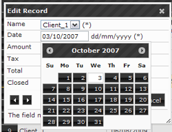
Can be: TextBox, TextArea, DatePicker, ComboBox, Checkbox The DatePicker show a calendar when the cursor is inside the text box
like this example:
Size:
The size of the form field element, only for TextBox, ComboBox and DatePicker
Cols:
Only for TextArea field type, is the width of the textarea
Rows:
Only for TextArea field type, is the height of the textarea
Required:
If checked the field is required to validate the form data
Max length:
Define the max length for the entered text, valid for textbox and textarea.
Min value:
Define the maximum number for the entered value, valid for numeric field.
Max value:
Define the minimum number for the entered value, valid for numeric field.
Validation:
The regular expression to validate the entered value, only for textbox.
The extension has a set of prdefined regular expressions but you can add your own regular expression on click on the button to the right. For datepicker field is the date format
Recordset:
Used for combobox field define the recordset to populate the combobox items
First item:
Used for combobox field define the text of the first item of the combobox
Value field:
Used for combobox field define the recordset field to populate the value of the combobox items
Label field:
Used for combobox field define the recordset field to populate the text of the combobox items
Table edit field:
Used for combo box define the table field must be edited.
Element prefix:
A text that will be show before the form element, can be used to add validation info for the user
Element suffix:
A text that will be show after the form element, can be used to add validation info for the user
Error message:
The generic error message in case the field is not valid. When the user enter in insert/edit mode and after click the submit button the extension validate the entered data and in case one or more fields are not valid in the top of the form will show the error messages. To this field will be add the value of the extra error message you can setup in the
edit panel of the extension